Rating Helmets
In football, helmets are important. Duh. I wouldn't want to be caught without a helmet on with Braxton closing in on me for sure, even though he'd pop it off for me. But in my opinion, the way a team's helmet looks is just as, and maybe just a little more, important than the way the jersey is designed. Granted, both need to go together in harmony, however when you start talking about teams, the vision of their helmets are what first pops in your head, so in that respect helmets are a team's identity. I've heard women who are not into football that much say they pick teams because their helmets look good. Surprising I know. Anyways, I'm not too fond of Kentucky's all blue helmet. Too much blue, although I love blue, it's just too much blue for a helmet. I like simple helmets. Straight up, this is who we are type of helmets and color schemes. I loved the white helmets with the blue UK logo on it. That was a sweet helmet and I wish they'd bring it back because it still would look good with their uniforms.
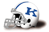
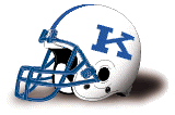
After finding a history of UK's football helmets, I decided to rank them in order of greatness since it is a slow period of the year. We have nine (9) helmets to look at dating back to 1970's blue stripe, all white helmet (vintage, yo!). Here's how I rank them between 1 and 5 stars, 5 being the best.
5 Star Helmets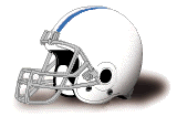
The first helmet is vintage man. I mean plain white with what looks like a triple blue/white stripe. So yeah, kinda like Penn St.'s helmet, and yeah, I'm a fan of their helmet (not their team). The second helmet is almost the same but with a better shade of blue and the 'K' on the helmet. This look adds a little old-school identity and is a classic. The third helmet might have a lighter shade of blue and has the blue face mask. Again, just classic and sweet.
4 Star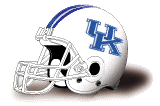
The only 4-star helmet, the only thing I don't like is the triple blue stripe, otherwise it's another great helmet of our time. Just the right amount of blue to white.
3 Stars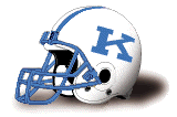
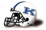
I love the 'K' on the helmets, but the shade of blue is almost like UNC's which makes this almost unbearable to look at. Just the wrong shade of blue.
2 Stars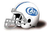
The first helmet here is almost a one-star but I liked the oval idea on the helmet but I don't like the word 'Cats' nor the shade of UNC blue. Otherwise if it were to have the letter 'K' or 'UK' in the oval and the right shade of blue this might jump up to a 3 or 4 star helmet. The second helmet I can say is a two-star because of the black. Don't add black to any UK logo or helmet. Just don't do it, it takes away from Kentucky's originality. All I can say is 'uck'.
1 Star
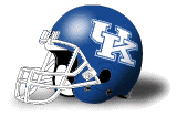
I'm not a fan at all of the state shape with the Wildcat head. I just think it's plain ugly. What can I say, I'm a simple guy. Plus the shade of blue again. Uck. The second helmet is Kentucky's current helmet, and although I've had to live with it, it's just too much blue. It's the right shade of blue, but it's too much, especially when they wear their all blue uni's. Too. Much. Blue. Period.
So there you have it. what's your favorite?
LIVEBLUE
![]() Labels:
Kentucky Football
Labels:
Kentucky Football


No comments:
Post a Comment